When dark mode was first introduced for iOS and Android devices in 2019, it took the world by storm. A feature that users had been clamoring for for years had finally arrived, and it has only grown in popularity. In 2023, 82% of smartphone users use dark mode in some way or another, and yet many UIs for websites and apps still cater largely to light mode users.
As a result, if you want to improve your website or app’s UI, you’ll need to start designing it for both light mode and dark mode users. But where do you begin? Below are some of our best practices for optimal dark mode UI design for apps and websites.
Design your light mode first
As popular as dark mode is, light mode will still be where your primary brand colors and design will be used. As such, it’ll be easier for you to design your light mode first and then use that as a basis for your dark mode. If your website and app are already designed in light mode, then you’ve already completed this step.
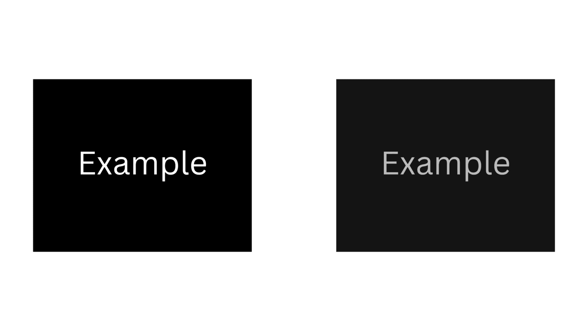
Avoid using white text on black background
When designing their programs for dark mode, many developers simply do a color swap—black text becomes white and white backgrounds become black. This may be easy to code, but it doesn’t make it easy for your users.
Remember, good UI design also depends on good UX design. White text on black background may look nice, but it is actually more difficult to read. This will ultimately make it harder for users to use your app or website, hurt your program’s UX and UI design.
Instead, have your background be black and your text an off-white or gray. Check out the picture below to see how this slight change can make dark mode text easier to read.
Keep it branded
While you can use a black background with an off-white or gray text for some things, don’t forget to still brand your website or app. After all, you want your program to look unique and to match your other forms of marketing (e.g., social media, newsletters, etc.).
But how can you turn your brand into dark mode colors? Easy. Simply use a darker version of your brand colors.
Check the contrast
Both light mode and dark mode depend on contrast for it to be legible. However, you need to get just the right amount. Too little contrast and your text will be unreadable, but too much and users will cringe away from your screen. When designing your dark mode UI, then, ensure that you have just the right amount of contrast for good UI and UX design.
Avoid oversaturation
For all the benefits of dark mode, it can be difficult to design because of how easy it is to make your program appear oversaturated. If you’re not careful, you can end up with a “neon” palette that will turn away customers. Remember, when you’re designing dark mode, any type of color will stand out more than usual. As such, you’ll want to cut down on the saturation and perform tests accordingly to ensure this.
Don’t forget to test your product
At the end of the day, good dark mode UI design depends on high quality testing. Here at Beta Breakers, we offer quality assurance testing for apps and websites. Contact us today to learn more.